LATEST CREATION- VAN DE VORT
Like many, we have a love-hate relationship with Instagram. We can't seem to figure out the newest algorithm and the constant updates, but it's provided us with so many great opportunities! We've met some amazing clients and lifelong friends through the app and that's exactly how we met our client Andrea, the owner of our latest creation Van De Vort. When we first met in person we connected instantly! She had a clear vision of what she wanted the space to look like, which was helpful for us. She showed us her mood boards and inspiration and we were instantly hooked! We couldn't wait to get started and dove right in!
THE CONCEPT
Andrea presented us with a mood board that was filled with checkered black and white floors, columns, old painted walls, globe fixtures and lush plants in every picture. In other words, all of the old-world cafe vibes that we die for! Like us sisters, she is a huge fan of Paris, France and wanted her shop to feel as though you had walked right into a European getaway. She envisioned a space with old world charm and a feeling that the place had been around for a while. Are you hooked yet, because we were! We got started right away with a concept and instantly connected with some of our favorite vendors to collaborate with including Portola Paints, North County Tile and Stone, Stone Impressions and Arto Brick. We were met with such a good response and were lucky enough to pick and choose some amazing materials that helped build what the new Van De Vort is today!
THE DESIGN
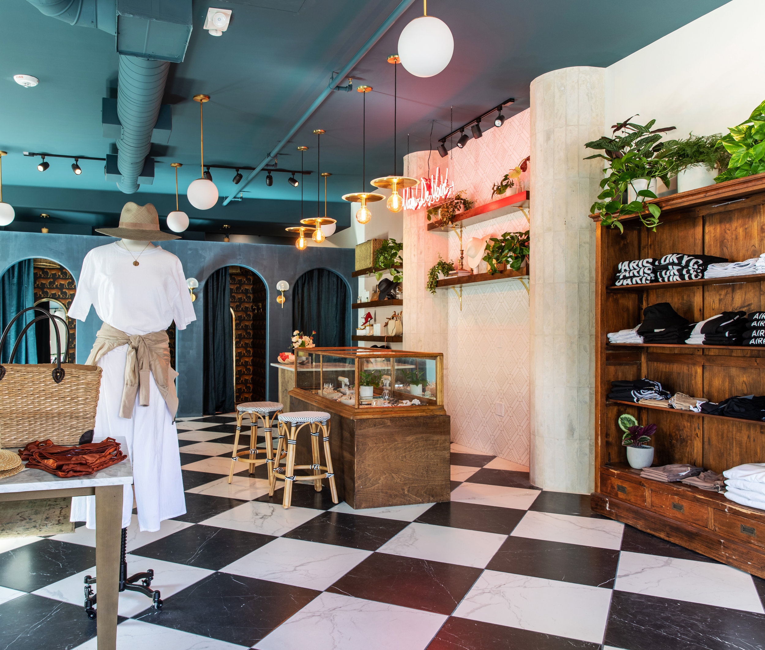
As we began designing the space, we knew we wanted to incorporate columns somewhere significant. We also wanted to define a clear point of sales area. We decided to flank two columns next to the cash wrap and wrapped them in the Arto Brick's Artillo Early Gray Limestone tile concrete. The finish was perfect because it provided the illusion that these columns had always been there, exactly the look we were going for! The Stone Impressions tile, The Aurum Collection, that lives in between the columns is the perfect amount of old world and glam!
Throughout the space and above the point of sale we added globe pendants with a modern twist to add to the “café” energy Europe is so well known for!
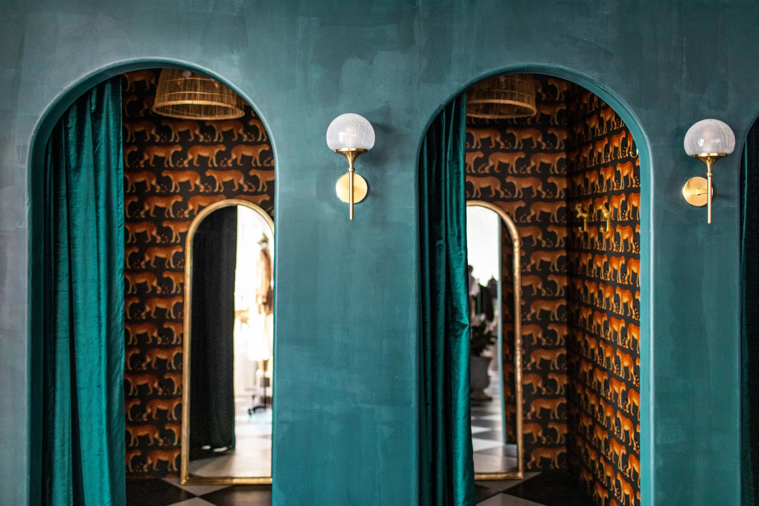
Adding archways to the dressing rooms was another way to create an old-world vibe in addition to the texture of the Portola Paint throughout. Portola Paints Roman Clay finish was perfect in this space. It has a matte, velvet finish that gives the illusion that it's clay or a plaster finish! We did some color blocking on some feature walls to modernize the space and define certain sections of the store! Designer Tip - color blocking is a great way to make a statement in a space without spending a lot of money!
Can we talk about the wallpaper by Cole and Son, provided by Kravet? Our client has a thing for sexy leopards. I mean, what fashionista doesn’t? Andrea found this wallpaper and knew she had to incorporate it into the space. We could not have agreed more! Great minds think alike because we all agreed without a doubt that it needed to live in the dressing rooms!
Now enter Prince Van De Vort, the shops mascot, who honestly needs his own Instagram handle. If you’ve been to this space you know who we're talking about. He sits proudly near the cash wrap guarding his castle. Yes, it’s the fabulous cheetah statue. While Andrea was sourcing for clothing pieces in the LA fashion district, she stumbled upon an entire shop of these babies! She texted us immediately asking if she should purchase him. Without hesitation we replied… “DUH"! One of the best discoveries has become one of our favorite elements of the space!
For us, the black and white floors really make the space special! Provided by North County Tile and Stone, we laid these tiles in a diagonal format to dress up the space a little which in our opinion screams Europe! Probably our second favorite part of the space! But really, how can you choose a favorite part…?
We couldn’t design the space without a little taste of Bali! These vintage teak shelves are straight from Indonesia and their finish adds a richness to the space!
In addition, all of the clothing racks are custom made with acrylic rods and brass hardware! They bring an element of elegance to the space but are subtle enough to let the merchandise shine!
The chandelier to us is the cherry on top! This piece was truly a labor of love. It took an entire day to put that pretty girl together, but SO worth the time and energy! She’s a beauty, isn’t she? This piece really makes the space and adds an eclectic, vintage vibe that we were all searching for in the beginning!
Swing by the new One Paseo development in Del Mar to check out this beautiful space! Be sure to take a selfie in the dressing rooms or re-apply your lipstick in one of the many vintage gold mirrors. Happy shopping! Your prince and castle await!
Love, The Sisters


