Posts in interior design
GET THE LOOK- 4TH OF JULY

The warmth in the air, the smell of barbecue on the grill, the sound of kids playing in the background; maybe you have a cold glass of rose in hand, sitting around a fire pit waiting for the fireworks to lighten the night sky. 

It literally feels like just yesterday it was New Years Eve yet this week we're all celebrating the Fourth of July, a day that marks the beginning of summer, aka the season for parties and outdoor activities! If you're hosting the party this year and need some help with some cute decor and outdoor furniture, we've got you covered. We've selected some of our favorite pieces that are perfect for the holiday and the rest of the summer season!

july-4th-outdoor.jpg
julky-4th-table.jpg

Wood Chargers

Star Plate

Napkins

Red Plate

We hope this guide helps all you amazing hosts out there! Happy Summer, happy shopping and Happy Fourth of July from our family to yours! 

Love, The Sisters

LATEST CREATION- SWIRL BOUTIQUE

Let’s face it. Shopping can be stressful at times. Typically, you’re searching for a particular item, a dress for a wedding, a suit for work, a gift for a friend or family member. When you walk into a retail store it’s important to feel welcome and comfortable. Otherwise you may not stay that long. What makes you feel comfortable in a space? Is it the flooring, are there comfortable rugs in the space? Is it the warm colors and tones of the wall paint. Is it the lighting? Is it the smell? Are candles burning or is incense freshening the air? Is it the type of product in the store? Are you surrounded by nature, flowers or plants? Is there a lot of natural sunlight? All of these things need to be considered to help make a space feel welcoming for your customers. At least these are the things we notice when we visit a space and we wanted the new Swirl Boutique to have all of these elements!

Our client Lisa, with Swirl Boutique, approached us earlier this year to help her design a new boutique location in Carlsbad! She wanted an elevated look. Something completely different than what her two current locations looked like. Her hope was to re-brand and create a more feminine look, than the signature blue that is Swirl Boutique. She presented us with inspirational images that were filled with beautiful terrazzo floors, pink lush fabrics, arched doorways and gold details. As we do with all of our clients, we gathered all of her wants and needs first and then develop a concept. A concept that would blend her vision as a boutique owner and our vision as the customer.

LISA'S CONCEPT INSPIRATION

s1.jpg

THE SISTERS CONCEPT INSPIRATION


s2.jpg

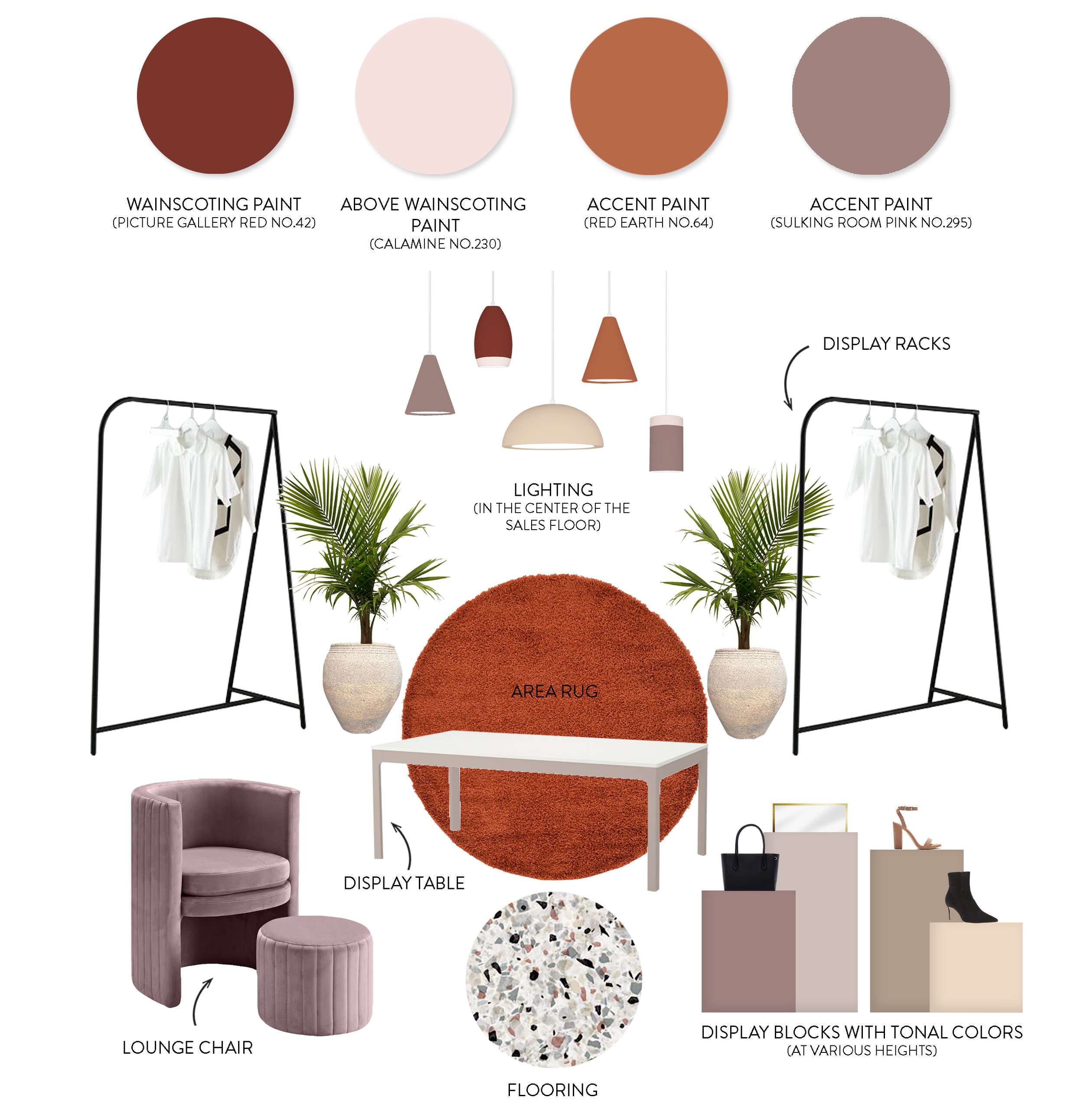
Lisa’s vision was completely on-point with our aesthetic. She was willing to take risks and step outside of her comfort zone to create a beautiful elegant space. Swirl Boutique became a space where Palm Springs meets Art Deco. Of course, we were immediately drawn to the all the terrazzo inspiration she presented and claimed that as the floor material. The tile we used was actually a porcelain tile mimicking a terrazzo design. A more affordable and durable option for commercial spaces. These beautiful floors drove the rest of the design. Next, this space needed depth and color. We used paint to color block the space to create interest and we pulled colors from the flooring and Lisa's mood boards. A beautiful pallet of pinks, maroons and violets was born. In addition, we included a burnt orange accent color to add contrast to the space. And because we are the sisters, no project is complete without a little touch of brass and black accents! Right?

s3.jpg
s4.jpg
s5.jpg
s6.jpg
s7.jpg

We custom designed the brass clothing racks and mirrors to mimic the color blocking design on the walls. We wanted to keep the space simple and clutter free. In addition, we wanted this space to feel clean, vibrant and youthful. You’ll notice if you are in the space that there are very few sharp corners. The curves in the doorways and color blocking on the walls, the rounded edges of the clothing racks, furniture and accessories. The rounded edges and soft details help add to the calming experience of the shop.

s8.jpeg
s9.jpg
s10.jpg
s11.jpg
s12.jpg
s13.jpg

As you enter the space you are greeted by a custom designed vinyl on the floor that reads “BEAUTY LIES WITHIN”. This was an important element in the space because although small and almost unnoticeable it’s an inviting gesture to all who enter. Simple words of encouragement that help the customer feel comfortable in the space. As you walk further in, past the beautiful clothing racks, you’re greeted by the custom designed point of sale area with the most beautiful white onyx countertop. The famous neon Swirl signage lives inside an arched niche that’s mirrored by an arch doorway into the style lounge and dressing rooms. Arches are in right now and so architecturally pleasing, again… we couldn’t help ourselves.

s14.jpg
s15.jpg
s16.jpg
s17.jpg

As you step into the style lounge you’re greeted by two very comfortable violet velvet chairs that sit atop a burnt orange shag rug. This part of the shop screams “take a seat and stay a while”. All you need is a glass of wine and someone fanning you with a palm and you’re staying until closing. The dressing room space holds 3 large dressing rooms, each one covered with royal blue velvet curtains. Inside the dressing rooms we installed a fun wallpaper and color blocking design with a rattan mirror (duh) and a modern style brass sconce (… also duh). Selfies are highly encouraged in these dressing rooms!

s18.jpg

Introducing the new Swirl Boutique in Carlsbad! A space to be yourself, be young, feel beautiful and discover that BEAUTY LIES WITHIN…

Love, The Sisters

EVERY SPACE HAS A STORY

Think about a space, any space. It could be in your own home or a space you remember from your travels. Picture the space in your mind. How did the energy feel in that space? What stood out to you visually? In fact, maybe you're sitting in that space right now. THAT space has a story.

When we design a space, we think about all of the pieces in that space as a whole and how the entire space has a dialogue. Each item and finish has a purpose and one of the most important finishes in any room is paint. Whether it’s on the walls or cabinet doors, paint color is critical to any design. So many people are intimidated by paint colors mainly because there’s so many to choose from. To us that’s the beauty of paint. The more colors the better! When we choose a paint color for a space, the process is the same as choosing any other item. And not only does the color of the paint matter, but the finish of the paint matters as well. The paint color and finish in a room helps tell the story of the space.

Portola Paints, the masters of paint and some of our favorite to work with! They have designed a full spectrum of paint colors and created unique finishes that completely transform any space. We’re drawn to their Lime Wash and Roman Clay finishes as they provide an antiqued natural texture that constantly reminds us of our travels. We’ve used them in several projects and most recently our project Van De Vort and Kaito Sushi. In each project we used different colors for different reasons.

VAN DE VORT

v1.jpeg

When we first conceptualized this project, we knew we wanted to create a space with old world vibes, antique accents and finishes that looked as though they had been there for years. Portola Paints, Lime Wash finish was the perfect touch. We covered the dressing rooms in Mare Island to compliment the wallpaper that lived inside. As you enter the space you’re immediately drawn to it’s richness. To us, this color and finish represents regality and wealth, perfect for a retail space, wouldn't you say?

v2.jpeg
v3.jpeg

To modernize the space we color blocked a feature wall with Portola Paints - Lime Wash finish in some of their Roman Clay colors (finish colors can be translated to the various finishes, just talk to the friendly staff at Portola Paints) Society, Costes and Mare Island. The pink tones help soften the space, creating an inviting and comfortable atmosphere for the customer!

v4.jpg

KAITO SUSHI

v5.jpg
v6.jpeg

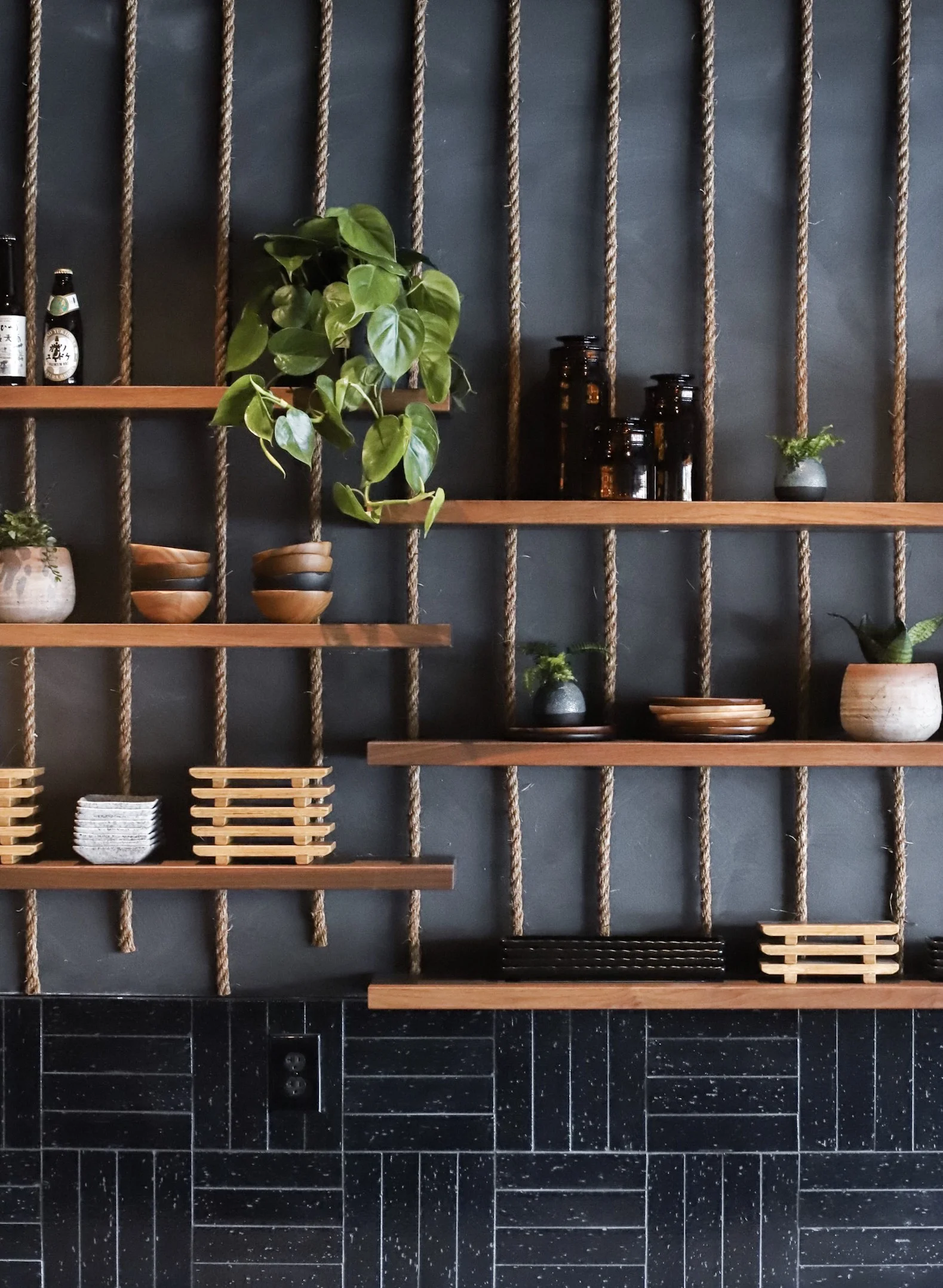
Our project Kaito Sushi was a completely different space than Van De Vort yet Portola Paints was a perfect application in this space as well. We used Portola Paints - Lime Wash finish in Roman Clay colors Fade to Black and Nitty Gritty. We wanted the space to feel moody and masculine. In addition, we wanted the walls to look leathered and worn, as if you were stepping into a fisherman’s cave.

v7.jpg
v8.jpg
v9.jpg

EVERY space has a story. These are two very different stories yet the application was the same! Portola Paints helped achieve our vision for each space and tell their story. What story is your space trying to tell you?

Love, The Sisters

THE SISTERS TIPS WHEN STARTING A RENOVATION

We've all had that moment. The moment you decide you want to renovate your home, but have absolutely no idea where to start. Well buckle in because the adventure is about to start here. We've done this a few times and have a few tips that might help you get started. The first thing to recognize is that renovation is a rollercoaster - there will be highs and there will be lows. If you're not a big rollercoaster fan don’t worry we'll be riding it with you with our hands up in the air, screaming and laughing until the end! Because we've been on this ride before we're sharing our tips and tricks to help you navigate this new adventure! Okay hands up… let the ride begin!

 
tip1.jpg
 

Create a Road Map

Sit down and map out your vision. Literally, write it down on a sheet of paper or draw it out. Answer these questions - What is your scope of work? When do you want this completed? Physically writing all of this out will help you understand what phase of the project you are in and help you understand each step, including timelines, lead times and deadlines.

In our office we have a white board that maps out each project and what phase of the project we are in. Every week we discuss the status of each project as a team and update it accordingly. Seeing this road map visually helps us organize our priorities for the week.

Make Sure You Have a Plan

Everyone loves a plan, at least we do. Making a plan will make your life so much easier when it comes to renovating. Write it down on paper - just like your road map. In addition, make sure each of the members on your team know the plan too. That's silly to say because it seems so obvious but things can always get lost in translation and pour communication can really f*** up a job. Communication is key in construction and design.

Commit To The Plan

This is very important for you as the client and for us as the designers. We'll say it again, COMMIT TO THE PLAN. Know that when you start making changes it will cost you more money and more time in the end. 

Susanna's Kitchen Renovation

 
tip2.jpg
 
 
tip3.jpg
 

Have All Materials On Site

This is something as designers that we highly suggest! We like to have everything ordered and onsite before construction starts. This makes the building and installation process so much easier. If you start ordering at the same time construction is starting, a number of things can go wrong, for example stock of an item may change or lead times may be longer than expected. Ordering everything ahead of time will alleviate stress during construction and installation! Trust us!

Phase Things Out

If you try to do everything all at once you may get overwhelmed. Many of our clients like to do their projects in phases. It’s easier financially and it allows for a less stressful process overall.

Walk The Site

This is very important! It’s so easy to just look at the plans two dimensionally on a piece of paper, but it’s so important to walk the site and the space before starting anything. Everything looks different in person! This is one of the first things we do with every client! As designers we are visual learners and this is one of the most important aspects of our job. There are so many details that go into a renovation and walking the site allows you to see the space in a three-dimensional way. In addition, verify ALL dimensions on site! The plans are never the same as the actual dimensions. We also suggest walking the site after you've conceptualized a design. This is a great opportunity for you to tape out all walls and large furniture pieces to help visualize the space.

Trust Your Team

This is the MOST important advice we could give you. Trust us and trust the process! We know what we are doing, we promise! This also means taking the time to choose the RIGHT team! Make sure you are comfortable with all the parties involved and let them do their job! This is our full time job and we will guide you! WE PROMISE!

 
tip4.jpg
 

Make sure throughout the entire process you ask questions. Your team is there to help you make this new adventure a little smoother and more manageable for you! And just think, when the adventure is over you’ll feel overwhelmed with joy and satisfaction… AND you’ll have a brand new space to call your own!

Love, The Sisters

MEET US IN MEXICO

We’re constantly inspired by the world around us and, in particular, Mexico. As some of you may or may not know we are of Irish and Mexican descent. That being said it’s safe to say that our heritage has influenced many of our designs. We’re suckers for an amazing decorative tile and a classic terra-cotta finish. With Cinco de Mayo right around the corner we wanted to celebrate by sharing our favorite spots in Mexico and how you can get the look in your own home!

OAXACA, MEXICO

One of our favorite cities in Mexico is Oaxaca. Known for its vibrant colored buildings, delicious food markets and unbeatable art scene. The colors of this city are so inspiring! Oaxaca undoubtedly has a soul of its own! Don’t be deceived by its size because this little city has a big heart and a huge personality!

mx1.jpeg

Photos: Pinterest

GET THE LOOK

Paint a door in your home a fun vibrant color.

Go bold with paint colors by accenting a wall in your living room, bathroom or bedroom.

Play with paint colors on the trim of your doors, windows or stairs.

HOTEL SAN CRISTOBAL

If we were a hotel we would probably be this one. This gorgeous space is filled with stunning decorative tile everywhere you look, simple textiles, colorful accents and breathtaking views!

We love every design element in this hotel and are inspired by Hotel San Cristobal on a daily basis! Is it obvious? HA!

mx2.jpeg

Photos: Hotel San Cristobal, Pinterest

GET THE LOOK

You can never go wrong with a beautiful decorative tile on bathroom floors, backsplashes, fireplaces or stair risers. 

Add some clay pendant lights or rattan furniture to bring some natural elements into your space.

Accent pillows are a great way to add a pop of color to any space.

PLANTS PLANTS PLANTS - can’t go wrong with some cacti scattered throughout your space inside and out.

mx3.jpg

Decorative Tile

Pendant Lights

Accent Pillows

Terra-cotta Pots

Chairs

HOTEL TIKI TIKI, TULUM

Close your eyes and imagine yourself laying in a hammock slowly rocking back and forth. Listening to the wind flow through the palm trees outside. It's peaceful and serene. You open your eyes and see lush greenery outside and blue skies reflecting on the pool below. This is the experience of Hotel Tiki Tiki in Tulum. The energy in this space makes you feel like you’ve walked right into a jungle paradise. The décor is simple with modern nods to classic Mexican design.

mx4.jpeg

Photos: The Venue Report, Pinterest

GET THE LOOK

The color blue calms the soul. Adding blue accents in your furniture or floor tile makes any space feel a bit more serene and spa like.

Low comfortable seating such as a hammock or accent chairs and stools will make the space feel more inviting.

Dark wood accents add a richness to the space.

Breeze block is a great way to divide a space inside or outside while allowing light and air to flow through. Keep in mind breeze block is best in space where you are exposed to the elements.

mx5.jpeg

Yellow Vases

Accent Lounge Chairs

Woven Stool

Rattan Bar Stools

Blue Pot

Decorative Tile

We could go on and on about the inspiration we find in and throughout Mexico. But for now we hope this post inspires you to be a little bolder with color and texture in your home! Take risks but stay true to who YOU are. This is us and we are proud to celebrate and share it!

Happy Cinco de Mayo!

Love, The Sisters

AN INTERVIEW WITH OUR GENERAL CONTRACTOR

You're sitting in your kitchen and the dated cabinets that are staring back at you are due for a little makeover. Maybe even new hardware and a new countertop. All of a sudden inspiration hits and visions of a beautiful new kitchen floods your mind! But where to start… well we've got all the answers right here!

We get asked questions all the time about where to start with new construction. Questions like, who should I talk to, what should I do first, can I afford a remodel? Well we've gone straight to the source, this week we sat down with our long time friend and partner Brian, a professional General Contractor and owner of Fassino Construction. He's helped us with a lot of our projects and most recently our project Modern Farmhouse. If you're starting construction and don't know where to start or maybe just have some questions, KEEP READING!

gen1.jpg

How did you get into construction?

My love for architecture and building started when I was 5 years old, building “homes” in the sand box for my younger brothers. Then, around the age of 9 I discover Frank Lloyd Wright and was immediately hooked on his incredible designs, I ordered books on this work while still in grade school. After college, I went to work for several large international architectural engineering companies, but after 20 plus years working for corporate America I decided if I was going to work 7 days a week, I would prefer being my own boss. I figured there is nobody better I would rather work for than myself! 

I started Fassino Construction 16 years ago with the idea that I would build my own designs. Having my own company allowed me to fulfill my craving for touching every piece of the project from conception through turning the keys over to the owners.

gen2.jpg

What's your specialty?

At Fassino Construction we like to say, we specialize in doing it right with extreme attention to detail and precision. As for our construction specialty, we specialize in design-builds (new home construction), full home remodels, additions, kitchen and bathroom remodels, tenant improvements/light commercial and every now and then a doggie door. Because we love what we do we don’t put boundaries on the type of work we will do, we love a good challenge!

What do you recommend the client do before starting a construction job? Any specific steps to take?

Have a clear understanding of goals.

Prioritize a list of must haves and a wish list if budget permits. 

Set a budget.

Research design ideas. Sites like Houzz, Pinterest and home improvement programs are great for ideas. 

When it comes to do doing a remodel or building a new house, check with your local planning department first or hire a specialist to do the research for you, they understand all the different departments and agencies that will have jurisdiction over your project. Even with a kitchen or bathroom remodel there are very specific code requirements, it is important to design to those requirements from the start. Working with an interior designer, architect, engineer, and general contractor from the start will not only help with understanding construction requirements but also help with related construction costs. 

Keep in mind, detail is your friend, the more you provide the contractor the better chance you will have of achieving or exceeding expectations and staying on budget. It also helps everybody involved to have the same goals. 

gen3.jpg

Any advice on developing a budget for construction cost? How do you know if you can afford a remodel or not?

A general contractor is one of your best sources for helping you develop a budget and in helping you understand what you can afford to do and how to place value on the important aspects of the project.

Too often, the general contractor is placed at the end of the cycle after the project has been designed and permitted, with the idea the owner can find a contractor that will meet their budget price. This is where the problem lies. You start looking for a contractor that tells you what you want to hear and not necessarily reality. Eventually, you will find THE contractor, however that doesn’t mean it is a good thing, it could be the start of a horror story. By focusing on cost, you start placing less weight on quality and ability to perform.   

A better approach would be to start working with a general contractor from the beginning, one that has a strong understanding for the meaning of “Value Engineering”, a solutions provider. This is critical for developing a budget for success. It also allows for complete transparency, setting goals and establishing an agreement with the contractor on a fair value for his or her Project Management services. Not only that but developing a good relationship with your contractor early on also creates a sense of ownership and pride for the contractor. They are far more likely to go above and beyond knowing they were part of the process from the beginning. It also creates mutual trust, a win-win for everyone.  

What to avoid doing or suggestions to help make living through a remodel easier?

Develop a construction plan with your contractor for phasing of work and house rule, such as, hours of work, a list of workers and their roles, where workers can park, and where materials can be stored. These simple steps will greatly help in reducing disruption in your home and life. 

gen4.jpg

When a client gets two bids and they are comparable in price? What should they then base their decision on?

Before selecting a contractor, make sure the contractor is licensed, bonded and insured. All General Contractors are required by California law to be licensed, bonded and insured.  

Getting multiple bids is a good idea as long as you provide the contractors with a very detailed scope of work. Without that, trying to compare apples to apples will be impossible. Plus, a bid doesn’t tell you equally important details such as reliability, abilities, and quality of work. Ask your contractor for references. Even better ask to see some of their past project work.

Another thing as a licensed General Contractor the State of California requires is very specific verbiage in our contracts, even specific font types and text sizes. If a bid doesn’t have that, buyer beware. A contract should spell out in detail exactly what is included in the scope of work and what is not. It should match at minimum in detail the scope of work provided.

Do you folks develop the schedule or the client? Can you give any tips or thoughts on this?

As the general contractor, we will develop the schedule with input from our clients. As for tips or thoughts…good communication is critical for setting a realistic and achievable schedule.

Any tips on staying on schedule?

Staying on schedule starts long before the project work starts. Spending time on the details during the planning stages of the project by identifying products and materials will dramatically help stay on schedule. It allows for products and materials with long order lead times to be ordered in advance and made available for installation when needed versus having to wait for them to arrive.  

Spending the time on details will also help reduce the chances for costly Change Orders. 

Tips on staying on budget?

Again, planning, details, and having all the right people on board from the start greatly helps with staying on budget. It is common for clients to hold back on the amount they can spend with hopes it will control the project bid cost, which it may, but usually it just reduces the scope of the project or eliminates options or opportunities. If you want to get the best bang for your buck it is best if the people helping design and plan your project have a clear understanding of the true budget available to work with. 

Tips on how the client can relay their ideas to you?

Put everything on the table from the very beginning. Knowing what your goals are will help us in developing a strategy throughout the project and don’t be afraid to talk about new ideas and changes you want as you see the project progress forward. It is very common to have new ideas during construction. I always say, a great project evolves during the building process. People just see things differently once work has begun versus how they imagined it or compared to the project on paper. The important part is addressing these changes as early in the process as possible. This helps with controlling cost and staying on schedule. 

Who typically buys the materials when building?

The Contractor and here is why. Gone are the days of building whatever you want as construction has become very sophisticated from just 10 - 15 years ago, especially with all the fires in recent years, along with very strict energy building codes. Construction today, requires very specific building products, products that meet these new code requirements. It is also not one size fits all anymore. For example, a different fire code requirement can apply on the same street depending if a house backs up to open space or another house or street. Contractors today, are in a lot of ways like doctors and teachers. They require continual education to keep up with all the new regulation and certification requirements.  Contractors also have suppliers that carry these specialty items, items that are not found in the big box stores, many of which only sell to licensed contractors.

As far as materials like tile, lighting, and plumbing fixtures, these items are either purchased by the contractor, designer, or customer. With today’s strict building codes, it is important that the customer consult with an expert who has knowledge of these code requirements. For example, today’s electrical codes require a certain type of motion switch, lighting fixture, and venting in bathrooms while plumbing codes requires lower water usage toilets and shower heads. Consulting with an expert can save the customer money and avoid getting stuck with materials and fixtures that cannot be installed due to these code requirements. 

Describe the value of having an interior designer on board as part of the team?

Not only is it a great idea, it is a smart idea, to have an interior designer as part of the team. They bring a wealth of knowledge, a walking product encyclopedia so to speak, with an understanding of what the current trends are and products available. Interior designers also help keep the client focused on the important issues, things that can cause construction delays. 

Now, you want to drive yourself crazy let’s talk about paint colors. You think white is white and black is black, think again. There are thousands of whites and blacks to choose from, each having just of enough in color similarities as the other and just enough differences to drive you crazy trying to pick the perfect color. This is where your interior designer is invaluable, if for your own sanity alone. They have an incredible sense for which color(s) pulls all the other pieces in the room together to create a seamless bond.

People tend to get bogged down and struggle over a single item not seeing the whole picture. An interior designer is skilled at seeing the whole picture and how each piece compliments the others creating a cohesive look that is timeless. Simply put, they just know how to make a space make you feel good.

Having an interior designer and contractor part of your project from the start just makes sense, they are the perfect flavor combination that makes a project spectacular and successful!

Now, how do you feel about that new kitchen remodel? A little more comfortable, a little more excited? When you're ready to get the ball rolling, we're here to help! Not only will we help you pick the perfect white paint color, but we'll create a beautiful new space for you and your family to enjoy every day! No more dated cabinets, hardware or countertops…

Love, The Sisters

QUIZ: WHICH INTERIOR STYLE ARE YOU?

Holy heck, how is it the end of the year already? This past year just flew by for us! We’ve been reflecting on some of the projects that came out of this year and years past and each one is totally different than the last. Interested to see which style you relate to the most? This could set the tone for your 2019 design style!

First things first, which drink would you choose on a girl’s night out?

A. Wine

B. Hot Toddy

C. Pina Colada   

D. Espresso Marini


Which color palette below are you most drawn to?

colors.jpg

What is your spirit animal?

A. I’m a bird

B. I’m a bear

C. I’m a monkey

D. I’m a horse


If you had to choose one, which of these plants would we find in your home?

A. A cactus

B. A stag-horn fern

C. The classic palm tree

D. A fiddle leaf fig tree


Choose a wood type:

A. White Oak

B. Maple

C. Teak

D. Walnut


You’re given a ticket to anywhere in the world, where would you go?

A. A tropical beach

B. A cool new city

C. The jungle or rainforest

D. The mountains


Pick a shoe:

A. Flats

B. Sneakers

C. Flip Flops

D. Boots


When I have a free moment to myself, I like to:

A. Spend time at the beach

B. Cook and create new recipes in the kitchen.

C. Go on a hike and explore.

D. Sit down and read a book.


Finish this sentence: I love the smell of __________

A. The ocean

B. Freshly baked cookies

C. Burning incense

D. A bonfire


HOW DID YOU SCORE?

If you answered “A” for most of your answers you relate most to our California Cool project. You love the beach and can’t be too far away from it. You enjoy the feeling of your toes in the sand and the warmth of the sun on your skin. You’re the hostess with the mostest and enjoy entertaining. You’re easy going and love spending time with family and friends!

colors2.jpg

If you answered “B” for most of your answers you relate most to our European Getaway project. This project undoubtedly reflects our love for Europe. The eclectic culture, the beautiful buildings and the history. If you relate most to this project you’re an adventurous soul. You love to learn and try new things. You’re spontaneous and enjoy the company of others. You love road trips no matter where the destination.

colors3.jpg

If you answered “C” for most of you answers you relate most to our Bali Villa projects. These projects have a special place in our hearts. They are different and each one has a different personality. Each one has lots of color and vibrancy. You too are a colorful soul. You crave adventure and travel, but you also love community and connecting with others. You’re creative and others are inspired by you!

colors4.jpg

If you answered “D” for most of your answers you relate most to our Modern Farmhouse project. This was one of our favorite projects this year. Simple, yet sophisticated. You enjoy spending most of your time with family. You like the comfort of your own home and on a Sunday afternoon we can find you curled up on the couch reading your favorite novel with a fresh cup of tea.

colors5.jpg

Happy New Year!

Love, The Sisters

CALIFORNIA COOL
cal1.jpg

What do you think of when you think of California? What thoughts or images come to your mind? The cool blues of the Pacific Ocean? The warmth of the California sun? Soft, sandy beaches? Visions of dedicated surfers catching their early morning waves? Tall palm trees lining every street? This was the question we asked ourselves when our client, who loves everything about our beautiful golden state, asked us to renovate her home.

Our client, a rock-star mom to a beautiful three-year-old little girl with another one on the way. Her husband loves to surf, and the entire family enjoys entertaining in their beautiful Encinitas home. She and her family moved into a cookie cutter home that fit the needs of their family but failed to reflect their personalities. That’s where we come in!

cal2.jpg
cal3.jpg
cal4.jpg

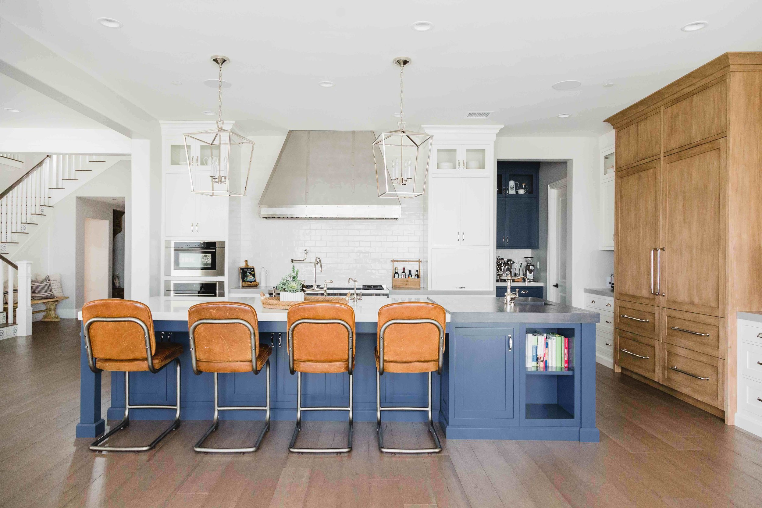
Starting with the heart of the home, we redesigned her existing kitchen, removing dated dark wood cabinets and replacing them with beautiful white wood cabinets. We added a gorgeous marble backsplash behind and a custom hood to match. We designed a new island, pantry and dry bar to complete a space that would become the centerpiece of her home!

cal5.jpg
cal6.jpg

Next, we tackled her main living area, which we believe coined the title #projectcaliforniacool. Here we removed the same dark wood media center cabinetry and replaced it with a custom designed white wood built-in, complete with shiplap details and open wood shelving. In the same room we added a white-washed brick wall behind her couch. Adding this detail in addition to some small accessories gave this room new life.

cal7.jpg
al8.jpg
cal9.jpg

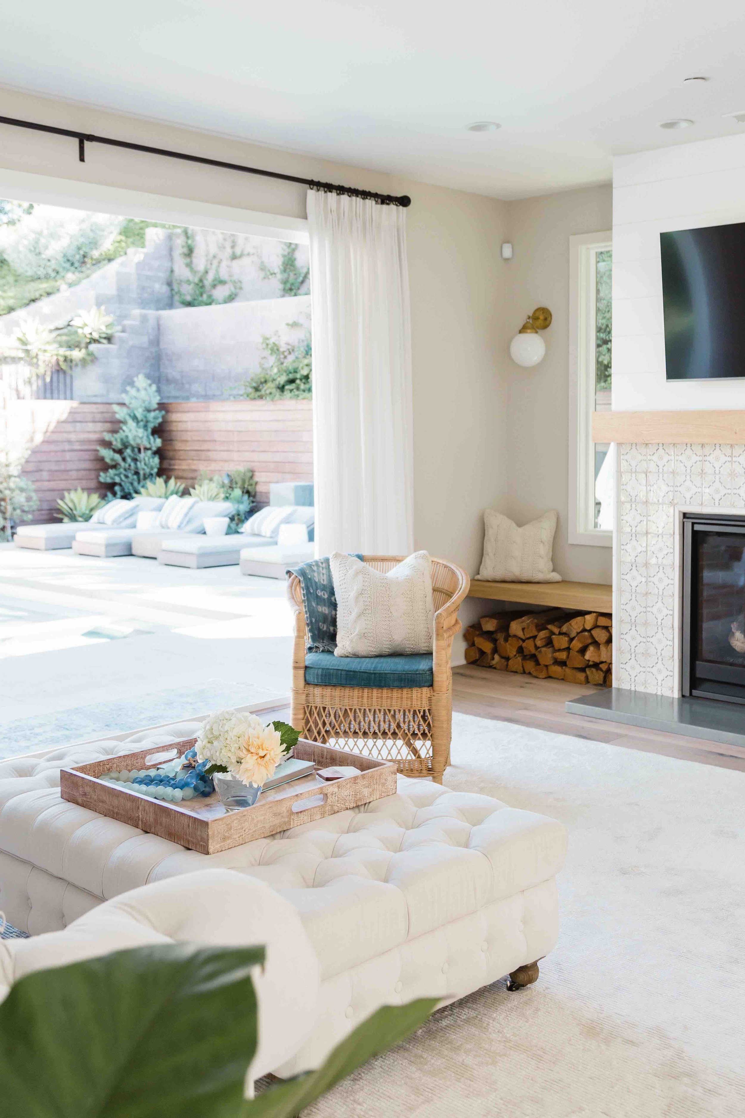
One of the biggest transformations to this home was in her sitting room. We moved an entire fireplace! That’s right people a fireplace - “It would look so much better if it was on this wall”, we all whispered to ourselves during a programing meeting. Well this tedious task turned out to be one of our favorite spaces in the home. By relocating the fireplace to another wall it transformed the flow throughout the home. Where the fireplace used to live, we replaced it with large sliding glass doors that opened up into her pool area. The fireplace was relocated to her back wall, designed with the same backsplash as the wet bar and beautiful wood accents and shiplap details from the living room.

cal10.jpg
cal11.jpg
cal12.jpg
cal13.jpg
cal14.jpg
cal15.jpg
cal16.jpg

Small changes here and there throughout the home made our client feel like it was a space custom designed for her and her family. Now when we ask you the question what do you think of when you think of California, what will you say?


Love, The Sisters

REAL WOOD VS. PORCELAIN WOOD TILE

So it’s time to rip up that nasty carpet.  First, high-fives all around because you don’t have time for that carpet life.  Now, you’re in a conundrum- real wood floors or porcelain wood tile? Religious followers of @ihavethisthingwithfloors understands how big of a decision this is.  Consider this your cheat sheet as we take you through the ughs and ahhs of both options.

Real Wood

The Ahhs of Real Wood -

Aesthetically pleasing

Timeless

Natural variation in each plank of wood

Improves your home’s value, if and/or when you want to sell

Longevity

More comfortable to walk on

Hardwood is warmer on your feet versus tile, especially noticeable in colder climate areas

The Ughs of Real Wood -

Can easily scratch, dent, warp, crack and chip over time and under the stress of traffic, pets and messes

Needs to be refinished and resealed every couple of years

Not easy to replace or repair after damages

Not eco-friendly

Expensive

tile1.jpg
tile2.jpg
tile3.jpg

Porcelain Wood Tiles

The Ahhs of Porcelain Wood Tile -

Can withstand damages such as scratches and dents

Waterproof and hold up great in high moisture areas such as bathrooms, laundry rooms and basements

Can be applied to any application

Eco-friendly

Inexpensive/Cost Effective

The Ughs of Porcelain Wood Tile –

Expensive installation  

Trendy and may go out of style

Tile is tough, but can still crack or chip

Can be slippery when wet

Loud acoustics- since tile reflects sound, it’s naturally louder. Rugs can help alleviate this issue.

Harder to walk on

Tile can be colder on your feet and this may be uncomfortable in colder climate areas

tile4.jpg
tile5.jpg

Once you have a good idea of what option will work best for you, now you need to figure out where to get your flooring.  We got you.

Real Wood Floor Retailers:

Cali Bamboo

DuChateau

Porcelain Tile Retailers:

Arizona Tile

Bedrosians

Suggested Cleaning Products:

Bona – Tile Floor Cleaner

Bona – Hardwood Floor Cleaner

Myers – Clean Day

If you’re still scratching your head, we can help with the most beautiful and affloordable option.  Yup. We went there. BUT if you really want to know our opinion real wood all the way!


Love, The Sisters

OUR BALI TRIP

Imagine this with us for a second. We’ve just arrived in Bali, we take our first steps out of the airport after a 24-hour flight. It’s a beautiful, warm, sunny afternoon in Bali, but our cloudy minds think its’ midnight the day before. Mopeds and cars rush by as we make our way through the crowd to our car. We’re greeted by some old friends and their welcoming hugs ground us immediately and we forget the jet lag. Laughter and conversation fill the air.

It’s been a year since we left this beautiful island, a place Elaina and her husband called home for 10 years. A place her two sons, Hudson and Quinn grew up in, a place they took their first steps and said their first words. A place full of memories. As we begin our journey to our villa the sounds, smells and views are so familiar. Feels like home again.

During our trip, we were lucky enough to stay in the same villa Elaina called home when she lived in Bali. We’ve since gifted this villa to our dear friend Angela and her family, owners of Cleobella. It is now called the Wyldrove Villa. When Elaina moved, we helped renovate the space with a few extra little touches such as our wallpaper that hangs proudly in the guest bedroom.

bali1.jpg
bali2.jpg
bali3.jpg
bali4.jpg
bali5.jpg
bali6.jpg
bali7.jpg

Bali, a little island, known for its iconic rice paddies, beaches and beautiful temples. All the rumors are true, this little place is slice of paradise.

bali8.jpg
bali9.jpg
bali10.jpg
bali11.jpg
bali12.jpg

Our time in Bali was spent eating authentic Balinese food, exploring the jungle with old friends, and practicing yoga at one of our favorite spots, Desaseni. Most of the trip was spent visiting old vendors and supply shops and gathering inspiration for new projects.

bali13.jpg
bali14.jpg
bali15.jpg

Words and pictures do not do Bali justice. You’ll need to experience it for yourself and we hope you get the chance because this little island has a big and beautiful heart.


Love, Jess

OUR DESIGN PROCESS

Football players need plays.  Cross-country trips need maps.  Builders need blueprints.  And the sisters… well, we need a process.  In fact, it’s so fundamental, it may as well be a part of us. 

Designing a space can be overwhelming, just like any project, but what most fail to realize is that the magic lies in the process.  The process itself is sacred.  People hire us to transform and transcend their spaces, spaces that can be so personal.  As designers we form the bridge between the clients’ desires and our creative eye.  And how do we build that bridge?

PROCESS.

process1.jpg

We listen.  Our process always starts and ends with the clients.  We listen to what they love and what they don’t.  We ask our clients to paint us a picture about the space we’re designing.  Are there kids running around or is it an adult only space?  How many friends come over for dinner and who’s cooking? (And also, can we come?) Are you cooking inside or grilling outside? What music is playing? Do you have pets and if so, can they chill on the furniture? Do you like a dark room in the morning or do you prefer to wake with the sun? What’s your favorite color and what’s off limits? Do you prefer form over function or function over form? This discovery, through the organic game of question and answer, is paramount to the process. But it’s just the beginning.

We learn.  Once we have an idea of what the client wants, we deep dive into the plans.  We study the architecture. We research. We navigate through books and magazines.  We drive around and study buildings. We visit a museum or a particular restaurant.  All this in the pursuit of golden nuggets, those moments of inspiration that shape the design.  These moments are the magic keys that open the door to our creative path.  Marc Jacobs noted, “Design is a series of creative choices- it’s a collaborative effort, an evolutionary process.  Through the process, you realize what you want it to be.” 

We create.  Once the ideas are in place and the design concept has been established, we have our road map. We follow the map as it guides us through sourcing, ordering, purchasing, and managing of the project.  The process is heavily peppered with site visits, correspondence with the contractors, and eventually installation. It’s pretty extraordinary, not just for our clients, but for us as well, to see everything come together.  It’s a great day when you can stand in the marvel of a vision fully realized.

process2.jpg
process3.jpg

Like we say, the magic is in the process… and we’re the magic-makers. Process is everything.

Love, The Sisters

WHEN TWO WORLDS COLLIDE

FASHION AND INTERIORS 

“Clothes mean nothing until someone lives in them.” – Marc Jacobs

Yassss Queen!  In fact, that’s how we feel about home design.  Your personal aesthetic is a true form of self-expression.  Whether it’s the teak and copper bowl you’ve chosen to sit on your coffee table or the statement necklace draping along your décolletage, home design and fashion are one in the same.  There’s something to be said about marinating in your own sense of style.  We are taking a page from Marc’s book and showing you some home design and fashion inspiration. 

wolrd1.gif
world2.gif
world3.gif
world4.gif

BLAZER: POSHMARK

NECKLACE: DESIGN 4 CORNERS VIA KIM EGEL - Available in store at Design 4 Corners or here.

WHITE T-SHIRT: MADEWELL

WINE TUMBLER: DESIGN 4 CORNERS

GOLD WATCH: FOSSIL

JEANS: NORDSTROM

RATTAN SERVING TRAYS: DESIGN 4 CORNERS

SHOES: URBAN OUTFITTERS - no longer available but these are similar (and slightly better)

Love, The Sisters

USING BLACK + WHITE IN YOUR HOME

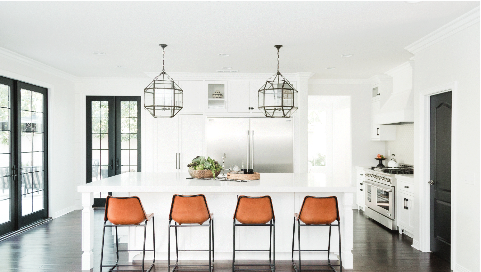
The centerpiece to any great kitchen is simply the people who fill it. When our client called for white, her favorite color, we were excited about creating a kitchen ready for her family’s most memorable moments. Using accents of black made this design dramatic without taking away from this clean and timeless look.

Screen Shot 2019-08-12 at 1.32.56 PM.png

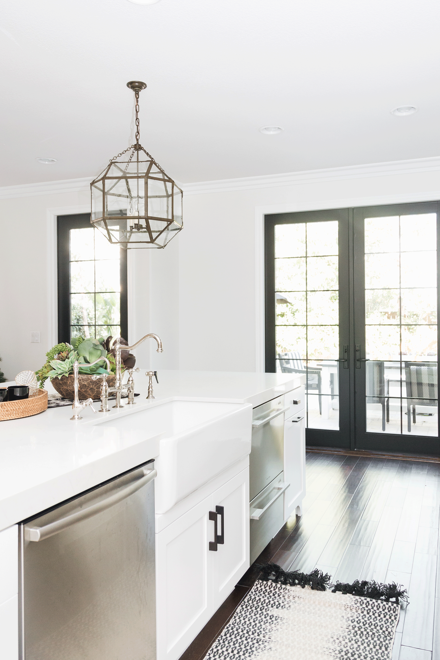
Our client is a high-powered attorney with two small kids who was looking for a sacred space, a solace for her family to gather. We removed her multi-angled, multi-height island and swapped it for a long, wide quartz counter island so she could keep her eye on her kids while she was cooking and completely transformed her outdated kitchen to a full-functioning space ready for entertaining.

black1.gif
black2.gif
black3.gif

It’s important to bring elements of the outside in, starting with natural light. We converted a window to a door and added an additional door, providing sunlight and access to the yard. Black framed and mullion doors, often called factory doors (and totally #trending right now), complimented the white space. Structurally, making these doors work was a challenge, but provided the design impact for that one-two punch, knockout kitchen.

black6.gif
black7.gif
black8.gif
black9.gif
black10.gif

If you look closely you will notice some architectural detail work in the cabinetry.  As designers, sometimes we delight in keeping it simple. Peppering this stark white kitchen with black accents made a big impact.   It’s an understated fabulous-ness.  White kitchen.  Black Accents.  Vibrant people.


Love, The Sisters

TIPS WHEN HIRING AN INTERIOR DESIGNER
hire1.jpg

There’s that sweet spot in time when the heavens part, mercury is not in retrograde and the stars seem to align in sublime orientation that beholden the path for the perfect interior designer.

We’re kidding…well, kind of. 

Finding the right interior designer can be one of the best decisions you ever make when it comes to your home, but it’s not a cosmic challenge.  It does, however, take some research to find the perfect designer to carry out your overall vision and setting reasonable expectations, especially when it comes to cost.  Just like you wouldn’t have your podiatrist do your facelift, you wouldn’t trust just any designer to makeover your home.  Here are our best tips when considering an interior designer.

hire2.jpg
hire3.jpg
hire3.jpg
hire4.jpg
hire5.jpg

TIPS:

BE PREPARED

If you’ve never worked with an interior designer understand that they don’t come cheap.  But it’s all about the return on your investment and hiring the right interior designer can save you time and money in the end. Be ready to be decisive and try to define your style as much as possible.  At the very least know what you love and what you don’t. We’re pretty sure that’s how Pinterest came to be.  It’s important to realize that for any and all projects, there are hundreds of details at stake, so it’s only fair that the designer is privy to what you are expecting.

ASK FOR A REFERRAL AND PLAN TO INTERVIEW

It helps to get a recommendation from someone you trust who has had a positive experience. And don’t hesitate to interview a few people or at the very least have a list of questions prepared for the designer. The relationship between a designer and client is an intimate one that requires a lot of clear communication so make sure you’re comfortable with your designer-to-be.  Trust is essential.

KNOW YOUR BUDGET

Interior designers have access to the universe of all that is low-end, mid range and the high-end.  If you don’t give them a number to work with, they will most likely aim for the high-end of your design wish list to complete your vision. It’s imperative for your own sanity and bank account that your designer understands what you’re willing to spend money on and where you’re willing to compromise. Designers are highly skilled and can get creative with your budget, mixing high-end with low-end. You can also consider an all in budget, budgets for each individual space, or a flexible budget that has allowances for all the moving parts. It’s worth the time to heavily consider your appropriate budget as most trustworthy designers will provide pricing on everything before anything is purchased to keep the project on track.

COMMUNICATION IS THE SECRET SAUCE

Like with any relationship, communication is pivotal to success. Be upfront about money, style and expectations in the very beginning and maintain those conversations throughout the process. Interior designers are not mind readers.  If you’re not happy with something, tell them. If you need more information, tell them. If you want to be more involved, tell them. Good communication or the lack thereof can make or break a project.


If you are considering an interior designer, you’re already on the right path.  Our tips will help you narrow down your options and get you to swipe right on the top-notch match for you.  Happy hiring!


Love, The Sisters

MODERN FARMHOUSE

E.T. wanted to phone home for a reason- anything to get him out of the cookie cutter, model home. Master planned communities with their superfluous amenities like safe and sound neighborhoods, amazing schools, and scenic parks are feasts for families, especially here in San Diego. Unfortunately, they also lack optimal space planning, attention to detail, and character. Each house is a copy-paste of the house next to it.

Enter Modern Farmhouse, the design trend that marries old and new, bringing warmth into dead space. Modern Farmhouse is aesthetically defined by ship lap, clean lines, a mix of rustic and industrial touches, aged brick, and soft and worn fabrics with texture that screams cozy.

For this family of 5, the carbon copy of the house next door wasn’t going to cut it.  They called on us to make this house a home and nothing says custom like gutting a new home and starting anew with a fresh, blank canvas.  (Don’t worry- all appliances were donated).  The “like a glove” barstools, rustic and worn in enough to make anyone want to take roots in the kitchen, nestle among high-end cabinetry.  We added a mud room, catch-all and command wall at the garage entry to accommodate this avant-garde family.  The staircase was re-designed, blending tile and aged wood.  The bathrooms put the luxury in functional, draped in clean lines and simple design with a slight industrial whisper.  This home was completely customized to align with the family’s needs and requests. 

From cookie cutter to sacred space, this beautiful Modern Farmhouse now hugs a happy family of five.  And E.T.

Love, the Sisters

A YEAR IN REVIEW: 2017

As I sit here in our new office and home boutique here in the coastal city of Encinitas, curled up in a sweater and sipping a hot latte, it’s hard to imagine that less than six months ago I was packing up my villa in Bali. The villa was the genesis of my family, where my children were born and raised, where my love for design became institutionally rooted. The villa was more than a structure. It was the foundation. But life is about big moves.

Since our inception, Susanna and I worked hard at creating a presence in both California and Bali. We created a company that slowly evolved over the years weathering through the economic crisis in America in 2008, supporting each other, as I became a mother and Susanna an auntie. We carried this company of ours on our backs through so many amazing adventures and wild and scary times (and might I add, from opposite ends of the globe). I think it was our deep seeded passion and stronghold for our purpose that drove us to keep moving forward.

Looking back on 2017, we didn’t just move forward; we moved up. To see our work spread through the pages of Elle Decoration, the cover of an Indonesian Home magazine, and spliced through Conde Naste Traveller is beyond words. We completed two massive villas in Bali (The Mandala House-@themandalahouse- and Villa Coco) and a huge 5,000+ square foot Modern Farmhouse here in San Diego.

Our brick and mortar boutique in Encinitas served as the icing on our proverbial cake in 2017. These projects nearly knocked the wind out of us and required a level of commitment that challenged our drive to continue, but the lessons learned will serve us forever. It’s a testament to our hard work, creative vision and pure passion for the aesthetic. And before we gear up for what 2018 has to offer we want to take a moment and just remember what this past year has taught us; it’s always worth it.

 As the creative guru and entrepreneur, Dave Brown, says, you have to “love your work, work your love.”  And that’s just what we’re doing.

All this time we never stopped believing that this would all lead to something great. To say that it hasn’t been easy would be an understatement. We’re so proud of this work and so grateful that we can share it with all of you.

From our family to yours, may 2018 be bold and filled with love and beauty.

Love, The Sisters

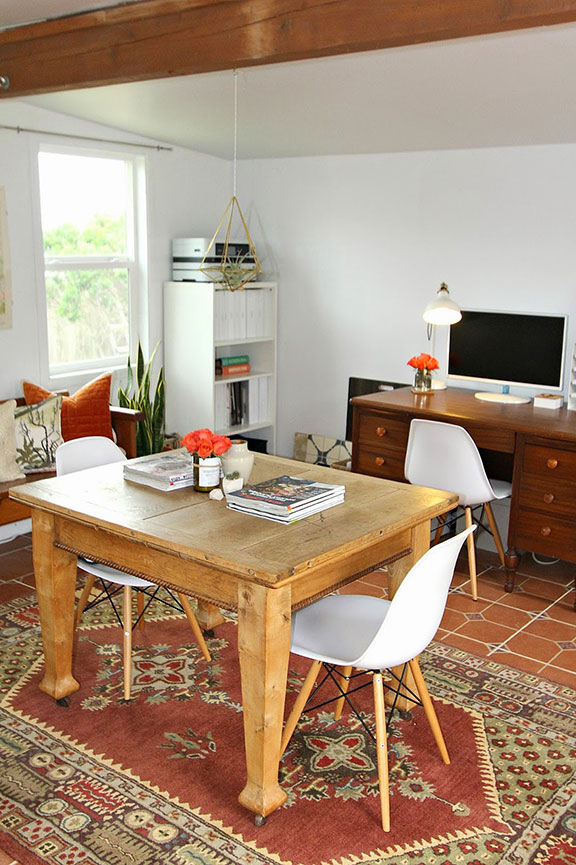
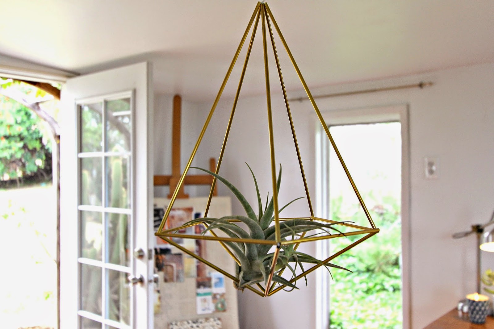
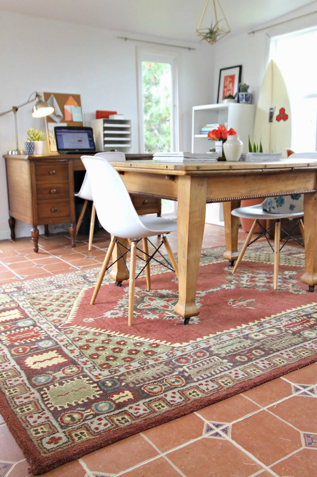
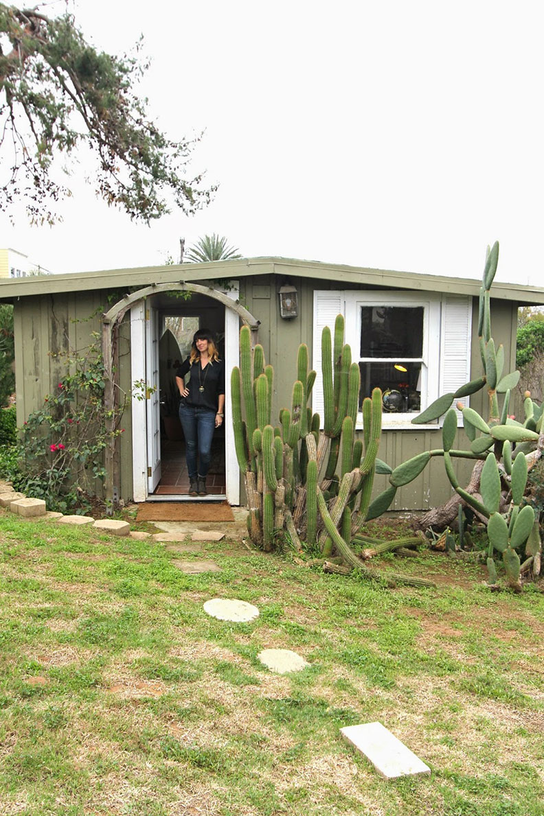
OFFICE TOUR
office6.jpg

Earlier this year we moved into our bungalow-style studio located near the beach in Encinitas, CA and it’s where we work when we’re in San Diego.

We keep the vibe relaxed and cozy, a typical day starts with lighting some candles, turning on the music and brewing a pot of coffee.

With it’s natural light and ocean view our bungalow is the perfect space to work on projects and gather inspiration!

STRIPES ALWAYS WORK
stripes2.jpg

No matter the size of the stripe, whether it’s traditional or unconventional, the stripe will always draw your eye. It’s the most powerful yet neutral and easy pattern to work with.

A bold and strong stripe is best when used in smaller spaces or where folks won’t be lingering; like the foyer, hallway or powder room. When using them on furniture or with your accessories like pillows the fool-proof method is mixing them with a floral and a solid. It will never fail you!

Stripes are the most classic, never-ending trend out there!

They have been around since the beginning of time and will never go out of style. When in doubt, use a stripe! It will be the biggest and boldest statement in your space. Trust us on this one! We pulled together our favorite uses of the stripe.

Tell us what you think!

OUR CURRENT BLOG CRUSHES

You may already know about these fabulous bloggers…but these days we find ourselves frequenting them on the regular for design inspiration.  If you haven’t stumbled across these creative do-er’s then get your lil butts to their design mecca’s and check them out.

  • Brittney Makes:  For project tutorials, and color overload!

  • New Darlings:  For a freakishly adorable husband and wife duo with mad mid century modern style, and MAJOR hair envy.  (Christina, your hair is to dye for!!!!)

  • House of Hipsters:  For “down to earth, I can actually achieve this look” design inspiration! Love it!

  • My Scandinavian Home:  For everything you wish your home was.

PILLOWS UNDER $50
36d10710af4b105ec87c536956604679.jpg

No matter the size of the stripe, whether it’s traditional or unconventional, the stripe will always draw your eye. It’s the most powerful yet neutral and easy pattern to work with.

A bold and strong stripe is best when used in smaller spaces or where folks won’t be lingering; like the foyer, hallway or powder room.

When using them on furniture or with your accessories like pillows the fool-proof method is mixing them with a floral and a solid. It will never fail you!

Stripes are the most classic, never-ending trend out there!

They have been around since the beginning of time and will never go out of style. When in doubt, use a stripe! It will be the biggest and boldest statement in your space. As luxury Interior Designers, trust us on this one!

We pulled together our favorite uses of the stripe. Tell us what you think!

Etsy – 123 .

West Elm – 123.

Target – 123.